
Examples of the changes in print type used in the early King James Versions.

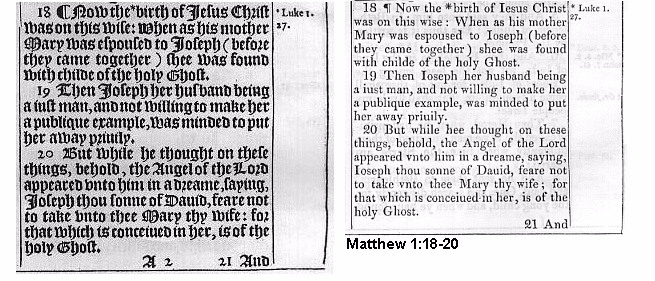
| This is the type of text [Gothic] used in the 1611 King James Version. Gothic print was also used in the 1613, 1616, 1619. editions. | This is the type of text [Roman] used in the 1612 King James Version. Roman print was used in the 1614, 1615, 1617, 1618, editions. |
The type style used in 1611 by the KJV translators was the Gothic Type Style. The type style you are reading right now and are familiar with is Roman Type. Gothic Type is sometimes called Germanic because it originated in Germany. Remember, that is where printing was invented. The Gothic letters were formed to resemble the hand-drawn manuscript lettering of the Middle Ages. At first, it was the only style in use. The Roman Type Style was invented fairly early, but many years passed before it became the predominant style in most European countries. Gothic continued to be used in Germany until recent years. In 1611 in England, Roman Type was already very popular and would soon supersede the Gothic. However, the original printers chose the Gothic Style for the KJV because it was considered to be more beautiful and eloquent than the Roman. But the change to Roman Type was not long in coming. In 1612, the first King James Version using Roman Type was printed. Within a few years, all the Bibles printed used the Roman Type Style.
The modern reader who has not become familiar with Gothic can find it very difficult to understand. Besides some general change in form, several specific letter changes need to be observed. For instance, the Gothic "s" looks like the Roman "s" when used as a capital letter or at the end of a word. But when it is used as a lower case "s" at the beginning or in the middle of a word, the letter looks like our "f." Therefore, also becomes alfo and set becomes fet. Another variation is found in the German "v" and "u." The Gothic "v" looks like a Roman "u" while the Gothic "u" looks like a Roman "v." This explains why our "w" is called a double-u and not a double-v. Sound confusing? It is until you get used to it. In the 1611 edition, love is loue, us is vs, and ever is euer. But remember, these are not even spelling changes. They are simply type style changes. In another instance, the Gothic "j" looks like our "i." So Jesus becomes Iefus (notice the middle "s" changed to "f") and joy becomes ioy. Even the Gothic "d" had the stem leaning back over the circle in a shape resembling that of the Greek Delta.